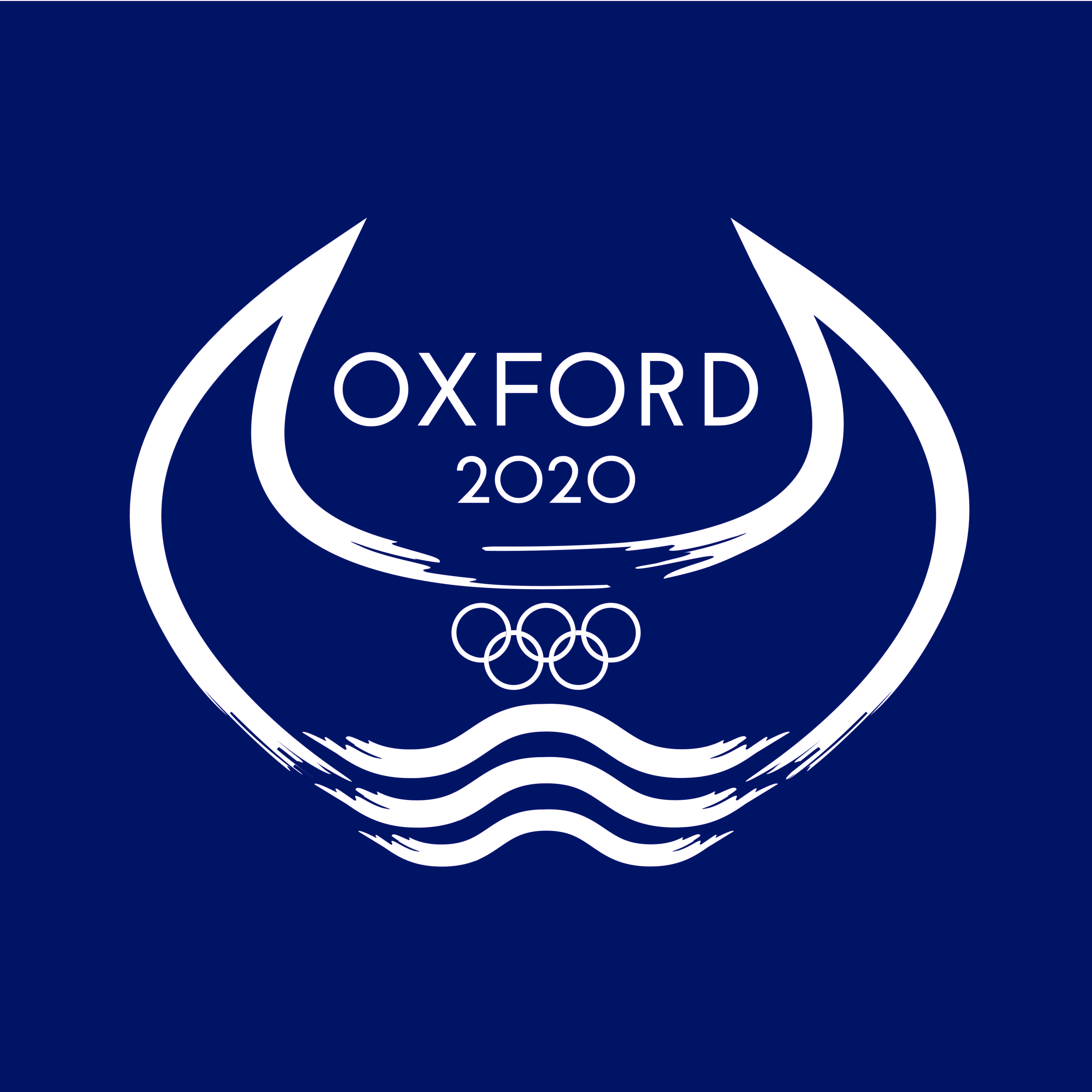
Unfortunately like everything else, the Olympics has been cancelled this year. But I took up Logo Inspirations challenge to design an Olympic logo for my home town, Oxford.
Ox, a large bull & Ford a small body of water that can be crossed by foot. I took the horns from the Ox, the shape is reminiscent of an athletes hands in the air and symbolises their strength. The Ford (water) embodies the graceful movement of the competitors, I accentuated this movement in the frayed edges of the lines.
I took stylistic inspiration and paid homage to previous city crests, Oxford City Council logos and the Oxford United badge.
Using Oxford Blue as the primary colour was a bit of a no brainer!
I chose to use the font Josefin Sans for its modern style and its perfectly circular Os that reflect the Olympic rings. I slightly modified the kerning and the 2’s and used Os not 0s in the date.